Dashboard widgets
Media/tools:
Adobe Illustrator, Adobe Photoshop
Shortly after Apple released Dashboard back in 2005, I got into developing widgets for a couple of years. (Surprisingly, this was not yet the point at which OS X hit peak skeuomorphism.) While fun to make initially, keeping up with the almost-weekly changes to WebKit required constant vigilance, and maintenance proved too irritating for me in the long run. None of these widgets work properly anymore.
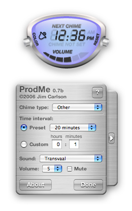
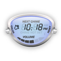
ProdMe was a widget for setting timed reminders, like clock chimes. It was surprisingly popular, and was even selected by Apple as a featured widget and staff favorite a couple of times.
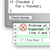
Lint Catcher was a front-end GUI for JSLint, a static code analysis tool for JavaScript. (Graphics were blatantly inspired by Strong Bad.)
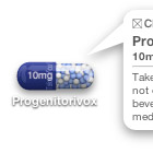
Medicate allowed the user to set reminders to take medication, something I myself was having trouble with at the time I made this. I never actually released this widget, because the vagaries of Dashboard made it difficult to keep it reliable, and I was concerned about the potential legal fallout if a user missed their meds. I still think it's a good idea, but these days, it would make a better phone or smartwatch app.
